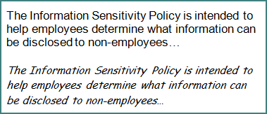
Nobody likes reading security policies. They tend to be long and dull. Yet, it’s important for the organization’s security and compliance posture that employees not only read, but actually recall the gist of these documents. Here’s a counter-intuitive theory: complicating the fonts in which the policies are published might improve employees’ retention of the concepts.

I’m basing this idea on the paper Fortune Favors the Bold (and the Italicized): Effects of Disfluency on Educational Outcomes (PDF). It describes research the explores the extent to which “making material harder to learn can improve long-term learning and retention.” By merely adopting fonts that are harder to read, researchers were able to improve participant’s retention abilities.
In one study, some groups of high school students were presented with learning materials using a standard fonts, such as Arial; others were presented with materials using harder-to-read fonts, such as Haettenschweiler and Comic Sans Italicized.
Students using harder-to-read fonts scored higher on classroom assessments than those using standard fonts. Furthermore, when asked about their feelings toward the material, the students showed no significant difference between the two type of fonts.
The researchers concluded that retention of material “can be significantly improved in naturalistic settings by presenting reading material in a format that is slightly harder to read.”
So, what do you think: Will people improve their ability to retain contents of security policies if we start publishing them in Comic Sans Italicized, rather than Arial? Just an idea…

