Effective security warnings make the safest button most visible, stay brief while providing context, avoid technical jargon, and don't overwhelm users with repeated prompts. Microsoft's "Enable Content" button is problematic because users don't equate "content" with executable code.
Computer users are presented with a steady stream of security warnings, which are designed to help users avoid taking actions that put their systems and data at risk. Sometimes, a click on the OK button is all that stands between the person and an intrusion. What are the characteristics of an effective security warning? Let’s take a look at some examples.
Microsoft Office Security Warnings
Consider this warning pop-up from Microsoft Excel 2003, which would appear when the user opened a spreadsheet that contained macros, but the macros were disabled.
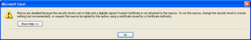
The text in this warning is too long and technical. The message offers no convenient way to enable macros: even after the user clicks OK, the macros stay disabled. That may be good for security in the short term. In the long term, the user would probably enable macros globally, just to avoid having to deal with this message again.
Fast-forward to Microsoft Office 2010. Starting with this version, the security warnings begame much shorter and to the point, such as the one stating that “Macros have been disabled.”

The biggest concern I have with this message is that the button to enable macros is labeled “Enable Content.” Non-technical users may not equate content with macros and click the button. After all, content isn’t code, right?
Here’s another, similar security warning from Microsoft Excel 2010, stating that “Data connections have been disabled.”

I doubt many users will know what “data connections” are and will click “Enable Content” for the reasons I outlined above.
Below is a Microsoft Office security warning that I actually like. It occurs when the user opens a document downloaded from the Internet, in which case Office uses a restricted viewer called Protected View, instead of a full-featured editor.

The warning explains the issue clearly using words that most people will understand, explaining the reason for the security concern and providing a course of action.
Web Browsers’ Security Warnings
Here are a few examples of security warnings presented by web browsers. Consider the following message that Firefox presents when the person finishes downloading an executable file.

Though the message presents no text of caution, at least there is no option to run the program—only an opportunity to “Save File”. In this case, the browser leaves it up to the OS to warn the user when he or she attempts to run the program downloaded from the Internet.
Here’s a similar message from Internet Explorer. It includes a warning, but leaves room for improvement:

The first button is “Run”, so that’s the one that will probably attract the user’s attention first. The fact that this is a security warning is “hidden” on the periphery of the dialog box: in its window title and the small footer text.
The Google Chrome team seems to pay a lot of attention to the design and text of their security warnings, and they continue to fine-tune this aspect of their browser. For details related to this browser’s warnings, see Google’s research paper Improving SSL Warnings: Comprehension and Adherence.
Recommendations for Designing Security Warnings
After surveying these and other examples of security warning messages, the following recommendations come to mind:
- Make the safest button (e.g., “Disgard”, rather than “Run”) most visible. This usually involves placing it first on the left, making it larger or highlighting it in a brighter color.
- Be brief. Users will ignore lengthy text, so include just a few necessary words in the main warning, giving people a chance to click a button for details.
- Include enough background details (e.g., the type of downloaded file) to help the person make a decision regarding the best course of action.
- Stay away from technical jargon that most users of the product won’t understand or will misinterpret.
- Don’t overwhelm the user with numerous warnings in a row. After a while, choice fatigue will prevent the user from selecting wisely.
Designing security warning messages is hard, because it often involves finding a compromise between conflicting goals, such as being terse while providing contextual details. Similarly, the developers need to balance ease of use with security. If you have recommendations or examples in addition to what I presented above, please leave a comment.